October 29, 2019
Kathleen
BY
Why We Rebranded Our Business
A brief history
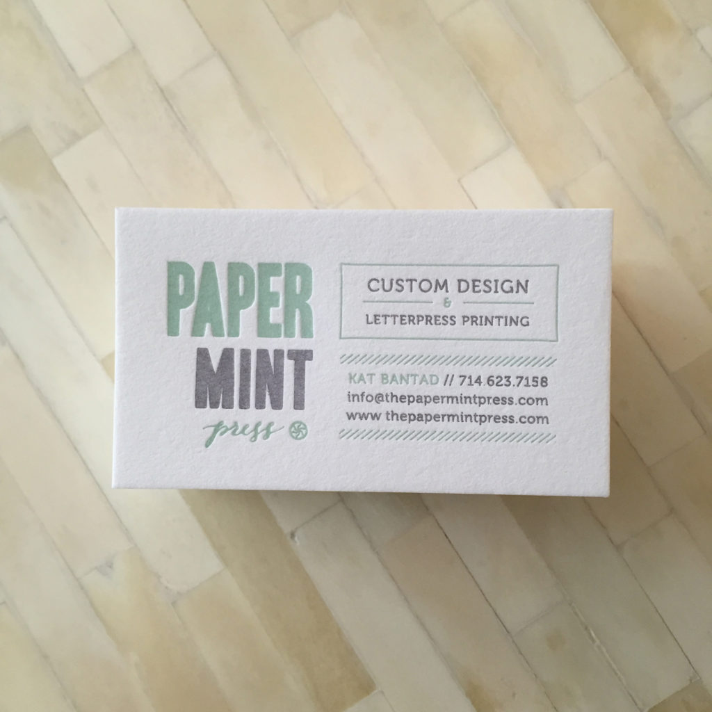
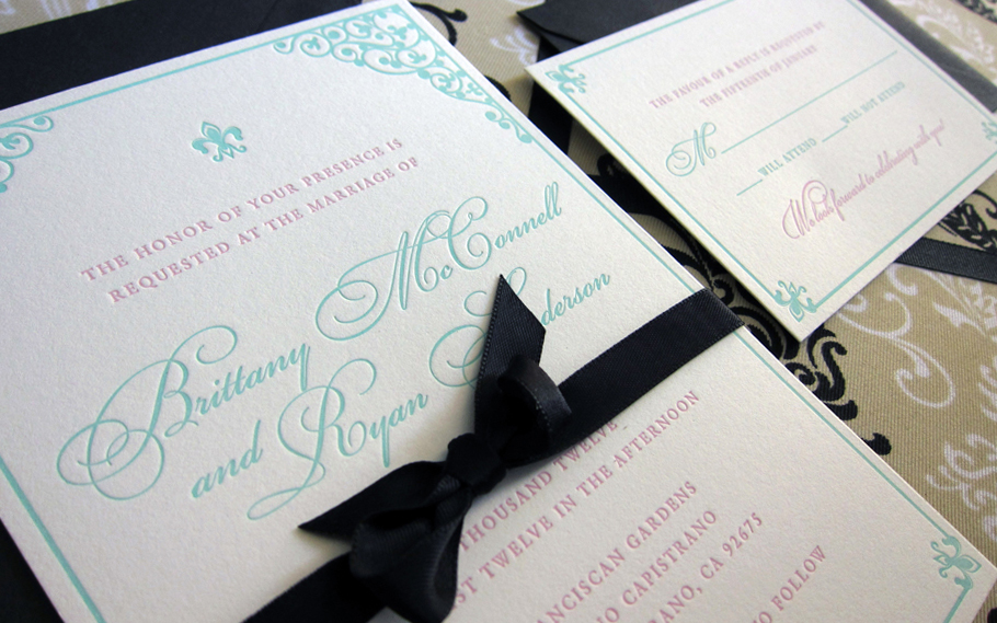
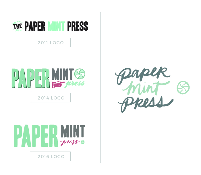
When I started Paper Mint Press back in 2011, it was really meant to be a side business. Emil and I were just learning how to letterpress and we were excited to have a new hobby together printing small orders for friends and family. We never envisioned this business to grow to what it is today. Needless to say, I hadn’t strategized or did any long term planning. My goal was just to design and print cool stuff – plain and simple. When I set out to design our first logo, I pulled some free fonts that resembled wooden type blocks; an homage to traditional letterpress printing techniques. Our website and brand felt generic because it was; we printed whatever people wanted whether it was business cards, personal stationery, or wedding suites.
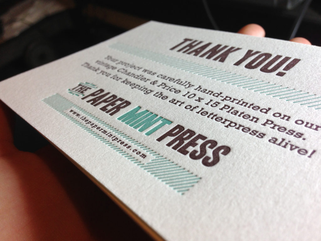
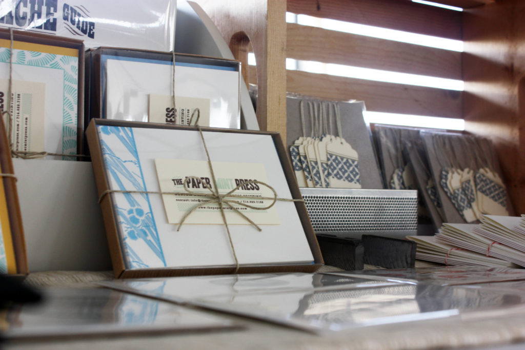
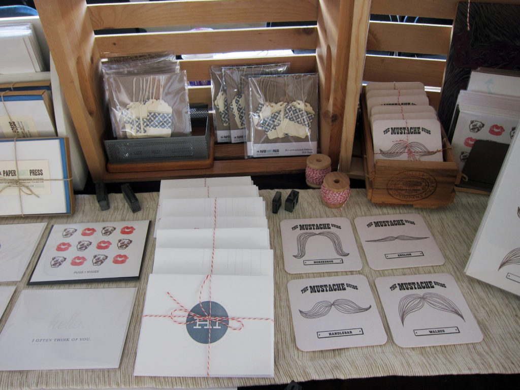
I made the first real update to our logo and website in 2014. It was my first time designing a custom website from scratch and my first time working with a developer to bring it to life. However, our website still wasn’t as user friendly as it could’ve been and it definitely was not optimized for mobile viewing. I admit I designed it purely for aesthetics and not for functionality. Sure I had contact forms on some of the pages and I did have a nice portfolio, but I hardly ever updated it. The ordering process still felt generic. The logo was looking a lot cuter, though! I updated it once more in 2016. It still had an old woodtype feel, but much more modern. I ditched the pointy hand ornament and kept the flywheel “mint” icon (duh). PMP was still mainly a side hustle, but somehow we were getting a lot more serious with the amount of jobs. Our free time was packed with print orders – mostly custom wedding invitations and business cards. Things were good.
Lots of life things happened between then and now. We bought a house, we got married, got another dog, bought a 2nd house, had a kid…
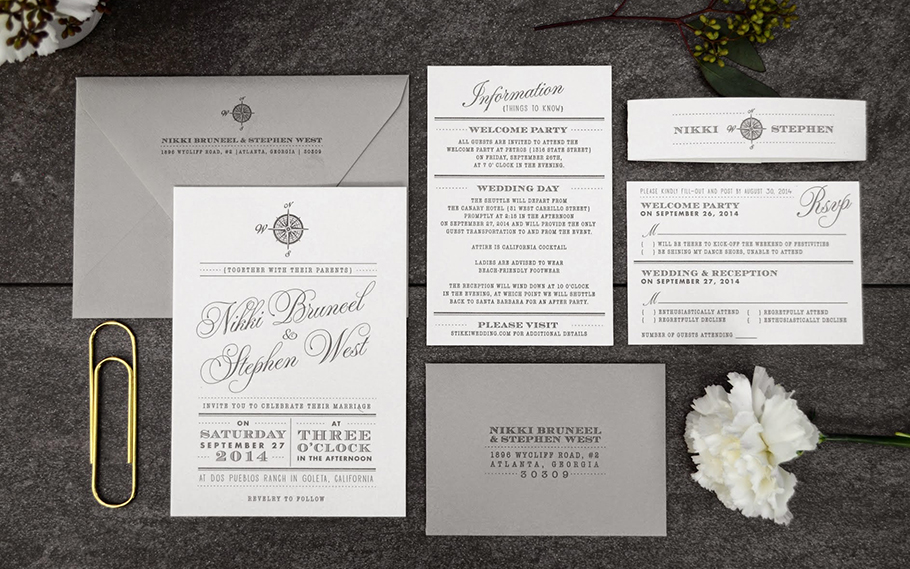
I don’t know if it was just me having a panic attack with a kid on the way, or just general burn out, but I decided that it was time to make my business run more efficiently. I felt that I was working a lot harder than I needed to, that I could streamline a lot of processes to save myself time, and to create a system that would allow me the option to hire people down the road. Emil and I also took a long hard look at the work we were creating – what sparked the most joy for us? We realized that business cards weren’t as fun as wedding stationery, and that we wouldn’t be sad to kiss that all goodbye. Therefore, I restructured everything to cater to the wedding and event industry. I knew we’d be taking on fewer clients throughout the year, and that they’d be longer and bigger projects, but a LOT more fun to create. It was important to us that we only took on projects that we would be excited about.
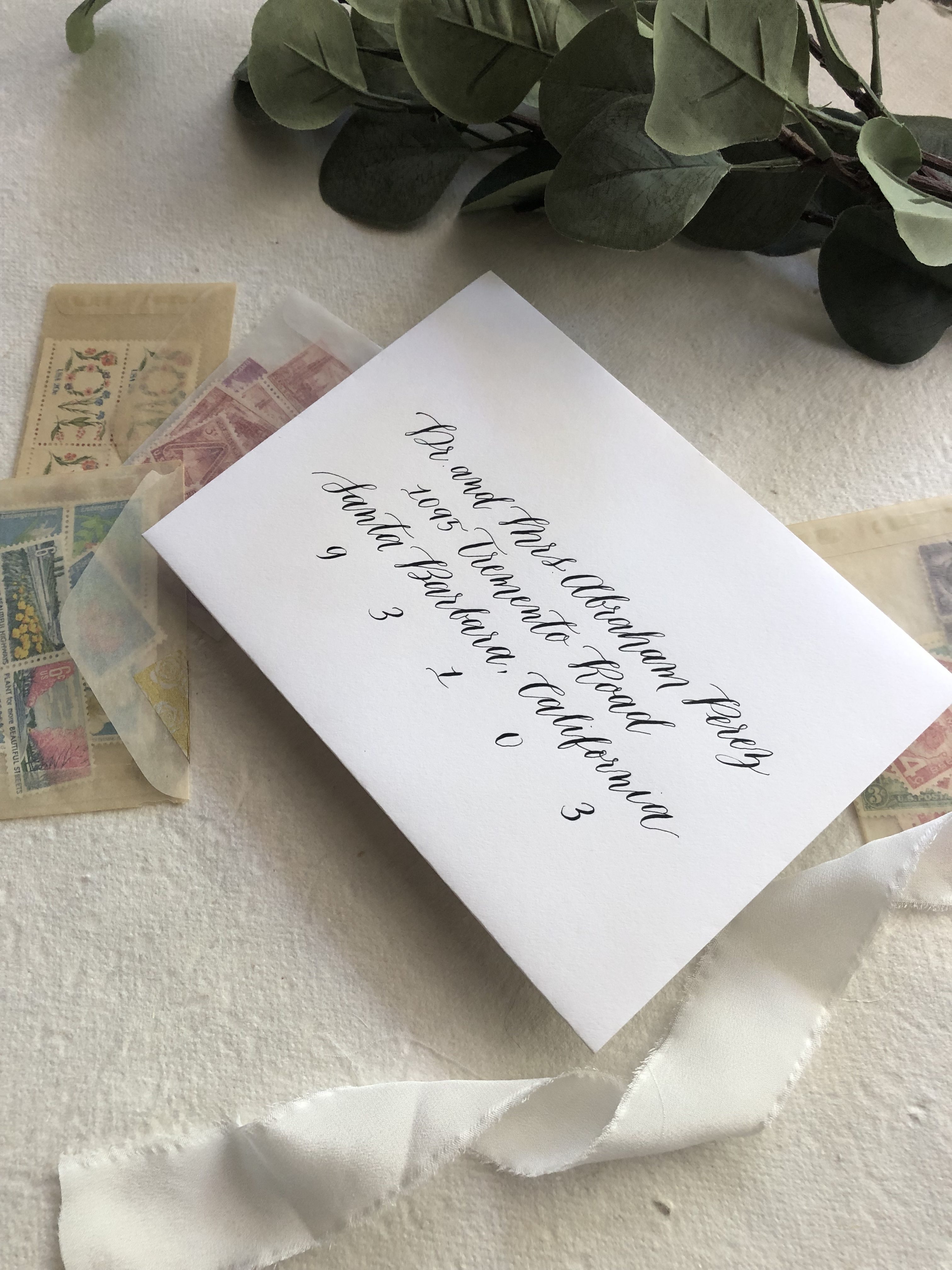
I had also been practicing tons of calligraphy, and it was definitely an aspect of my business I wanted to expand. This was the perfect time to introduce it. I also felt that with an infant at home, calligraphy was something I could do that required less man power than printing does, so I could work on projects slowly between naps and life. It was also something I purely enjoy and find extremely cathartic, and something that naturally fit into our business. While I’m still learning a ton, I felt confident enough to incorporate it in our services.
So with all of these changes, we set out to rebrand…
Problems we wanted to solve with rebrand & website redesign
Problem #1: No clear branding
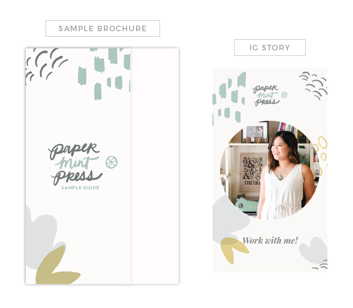
How we solved it: New logo design – Our old logo was an homage to wooden type, but we never actually print with wooden type. It felt outdated and inauthentic to our brand. I went back and forth between this casual look and a more “polished” logo, but ultimately decided to keep it playful. I developed a Brand Style Guide to use as a guide for all my social media, marketing, and print collateral (more on this later). It is important to me that our branding is consistent, recognizable and reflective of our personality as a company.
Problem #2: Limitless options were too overwhelming for clients
How we solved it: Customization guide – Since our business is mostly service and product based (yet not quite e-commerce), it was quite a challenge to communicate all of the options and ordering process to customers. This guide is a good overview of our options, from print techniques to paper/envelope colors, ink selections, and embellishments. We also launched our semi-custom Wedding Collection, and we hoped that with the customization guide, it would clarify many questions couples had and eliminate the need for so many in-person consultations. Don’t get me wrong, I love meeting my clients face to face, but I wanted to eliminate the need for meetings only to quote and have the client back out or change their minds. I wanted to make sure people were educated on the process and options beforehand, which would (hopefully) make meetings more productive and ensure that I book most (if not all) clients that I meet with. Anyway, what I was finding during meetings was that people were incredibly overwhelmed with ordering custom stationery. Most people honestly don’t know what they want until they see options in front of them, so our Customization Guide and Wedding Collection is a really good place to start narrowing down ideas and options.

Problem #3: No clear way to place an order
How we solved it: Online Order form – I wanted people to know exactly how to initiate their order, so we added a detailed questionnaire to capture information at the very beginning of the process. This step is necessary to put together a custom proposal, gauge our clients’ budgets, and allowed us to send our contract and timeline so the client knew exactly what to expect after initiating the project.
Problem #4: Clients needed help with wording
How we solved it: Etiquette guide – I created a simple etiquette guide located at the bottom of our customization guide to help with invitation wording. It’s a good resource to have people refer to and helps people think stationery logistics, like “how can we indicate how many people are actually invited?” or “how can we politely say no kids allowed?”
Problem #5: People wanted a way to address their envelopes quickly and affordably
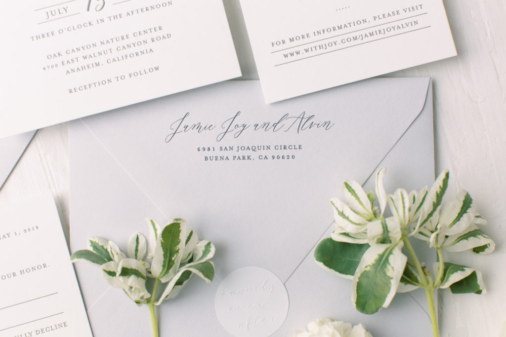
How we solved it: Envelope addressing options – I developed three different envelope addressing options for all budgets and timelines: digital printing ($, quick), digital + calligraphy combo ($$, quick-ish), hand calligraphy ($$$, requires time). Finally, clients could really order everything through us (minus postage). I really wanted the process to be streamlined and easy, and I think we we are priced competitively for these services.
Problem #6: Menus, programs, and place cards were usually ordered very last minute
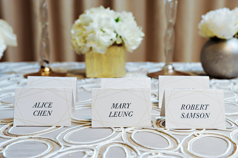
How we solved it: Day-of accessories – Couples who order wedding stationery with us usually end up coming back for day-of materials. It’s just so much easier and better to have all of the graphic elements match and keep your event branded. I admit this part was an afterthought on our old website – it was mentioned in our services but not really highlighted as something we truly offered, but it is such a huge part of weddings. It can be a cute way to personalize the details for each guest, and it’s just impressive to have coordinating pieces that match your wedding elements!
That’s our rebrand in a nutshell! Hope all of this adds value to our clients’ experience in working with us!
COMMENTS
0
COMMENTS
0
COMMENTS
0